Mastering the Spectrum: How Color Psychology Influences User Decisions on Websites
Introduction: The Unseen Power of Color in Web Design
Beyond Aesthetics: Why Colors Matter More Than You Think
In the vast digital landscape, where attention spans are fleeting and competition is fierce, every element of your website plays a crucial role. While crisp copy and intuitive navigation are vital, there’s a silent, powerful influencer often underestimated: color. It’s not just about making your site look good; colors are deeply embedded in our psychology, triggering emotional responses and influencing behavior without us even realizing it. Understanding how color psychology influences user decisions on websites is not just a design perk; it’s a strategic imperative.
What You’ll Learn: Navigating the Emotional Impact of Website Colors
This comprehensive guide will equip web designers, marketers, and business owners with the knowledge to harness this unseen power. We’ll delve into the foundational principles of color psychology, explore its direct impact on user actions, decode the specific meanings of individual colors, and provide actionable strategies for implementation. By the end, you’ll have a clear understanding of the emotional impact of website colors and how to leverage them to optimize user decisions and achieve your online goals.
Understanding Color Psychology: The Basics for Web Strategists
Defining Color Psychology: A Brief Overview
Color psychology is the study of hues as a determinant of human behavior. In the realm of marketing and web design, it’s about understanding how different colors evoke specific emotions or reactions from your audience. It’s not just a subjective art; there’s a science to why certain colors make us feel a certain way or encourage us to take a specific action.
The Science Behind Emotional Responses to Color
While some color associations are universal (e.g., red often signifying danger or passion), many are influenced by cultural background, personal experiences, and even gender. Physiologically, colors stimulate different parts of our brain, triggering a cascade of psychological and emotional responses. For instance, warmer colors like red and yellow tend to be more stimulating, while cooler colors like blue and green are often perceived as calming. This intricate interplay forms the basis of understanding the science behind color psychology and its application.
Context is King: How Culture, Gender, and Industry Affect Color Perception
It’s crucial to remember that color meaning isn’t absolute. What evokes trust in one culture might signify mourning in another. Similarly, gender can influence color preferences, and industry norms play a huge role. For example, green might represent finance in one context and environmental sustainability in another. Always consider your specific target audience and industry when making color choices to ensure accurate color perception and avoid miscommunication.
The Direct Impact: How Colors Drive User Decisions and Actions on Websites
Shaping First Impressions and Brand Identity
A user’s first impression of your website forms in milliseconds, and color is a primary component of that initial judgment. Colors instantly communicate aspects of your brand identity – whether you’re trustworthy, playful, luxurious, or professional. A cohesive and strategically chosen color palette can solidify your brand’s personality and make a memorable first impressions with website color.
Influencing Call-to-Action (CTA) Button Performance
Perhaps one of the most direct ways color influences user decisions is through Call-to-Action (CTA) buttons. The right CTA button colors can significantly boost conversion rates. Contrasting colors that stand out from the rest of the page, combined with psychological associations (e.g., green for “go” or blue for reliability), can subtly encourage users to “Sign Up,” “Buy Now,” or “Learn More.” This direct manipulation of attention and urgency is key to helping boost conversions with color.
Guiding User Attention and Navigation
Colors create a visual hierarchy on your website. Strategic use of bright, contrasting, or muted colors can draw the eye to important information, guide users through content, and simplify website navigation. This helps users quickly find what they’re looking for, reducing frustration and improving the overall experience. Effective user attention with color means less cognitive load for your visitors.
Evoking Emotions and Creating User Experiences (UX)
Beyond guiding attention, colors are instrumental in setting the overall mood and tone of your website. They can make a site feel calm, exciting, luxurious, friendly, or trustworthy. This emotional connection is a cornerstone of effective user experience (UX) design. By consciously choosing colors that resonate with the desired evoking emotions online, you can create a more engaging and memorable experience for your visitors.
Building Trust, Credibility, and Security
Certain colors have strong associations with reliability and professionalism. For instance, blue is often used in corporate and finance sectors to signify stability and trust. Green is commonly used for security alerts or positive feedback. A thoughtfully designed and cohesive color palette can significantly contribute to the perceived professionalism and credibility of your brand, playing a vital role in building trust with website colors and fostering user confidence.
Decoding the Rainbow: Specific Colors and Their Psychological Effects on Websites
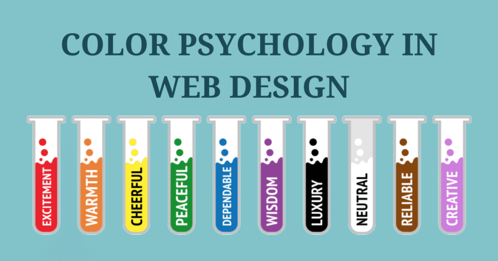
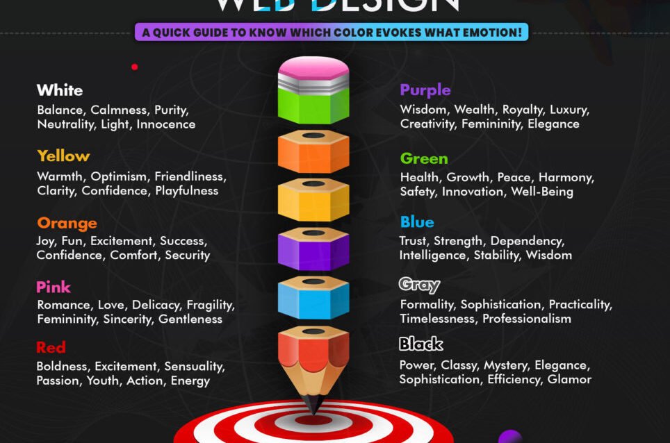
Each color carries its own set of psychological associations, which can be strategically deployed on your website:
- Red: Urgency, Passion, and Attention. Often used for sales, discounts, “buy now” CTAs, or warnings. It grabs immediate attention but can also be perceived as aggressive if overused.
- Blue: Trust, Serenity, and Professionalism. A perennial favorite for corporate, finance, tech, healthcare, and social media sites. Conveys reliability and calm.
- Green: Growth, Nature, and Health. Ideal for environmental, organic, wellness brands, and financial services (money). Also signals positive feedback or “go.”
- Yellow: Optimism, Energy, and Caution. Used by youthful brands, for highlights, warnings, or limited-time offers. Can be cheerful but also eye-fatiguing if too bright.
- Orange: Enthusiasm, Creativity, and Friendliness. Excellent for e-commerce CTAs (“add to cart”), creative industries, and child-friendly sites. It’s less aggressive than red but still energetic.
- Purple: Luxury, Royalty, and Creativity. Often seen on high-end product sites, beauty brands, spiritual content, or artistic portfolios. Evokes sophistication and imagination.
- Black: Sophistication, Power, and Modernity. A strong choice for luxury goods, fashion, tech, and elegant branding. Conveys authority and timelessness, but needs careful balance with white space.
- White: Purity, Simplicity, and Cleanliness. The ultimate choice for minimalist designs, healthcare, bridal, and creating a sense of spaciousness. Provides clarity and focus.
- Grey: Balance, Neutrality, and Formality. Frequently used for backgrounds, corporate sites, tech, and typography. A versatile supporting color that can feel sophisticated or dull, depending on its shade and context.
- Brown: Earthiness, Warmth, and Reliability. Popular for organic products, coffee shops, crafts, and vintage themes. Connects to nature, comfort, and authenticity.
- Multi-Color Palettes: Harmony and Dynamism. Combining colors effectively allows you to convey complex messages and cater to diverse audiences. The key is balance and purpose.
Applying Color Psychology: Strategic Implementation for Your Website
Defining Your Brand’s Emotional Message
Before choosing any colors, clarify your brand’s core values and the emotions you want to evoke in your target audience. Are you aiming for innovation, trust, excitement, or calm? This will inform your entire website color palette strategy.
Choosing a Primary and Secondary Color Palette
Select a core set of colors that work harmoniously. A common design principle is the 60-30-10 rule: 60% dominant color (often a neutral or your brand’s primary color), 30% secondary color, and 10% accent color (often for CTAs or key highlights). This creates balance and visual interest, forming a robust brand color strategy.
Leveraging Contrast for Readability and Emphasis
High contrast is not only vital for accessibility (ensuring text is readable for all users) but also for drawing the eye to important elements. Use strong contrast for headlines, buttons, and crucial information to make them pop.
The Power of White Space (or Negative Space)
Don’t underestimate the role of white space. It allows colors to breathe, prevents visual clutter, and enhances focus on your colored elements. A well-designed page uses white space to frame and highlight content, making your color choices more impactful.
Using Color for Hierarchical Structure
Varying shades, tints, and saturations of your chosen colors can create a clear hierarchy. For example, a darker shade for primary headings, a lighter tint for subheadings, and a vibrant accent for interactive elements can guide users seamlessly through your content.
Call-to-Action (CTA) Button Best Practices
The “isolation effect” is crucial here: your CTA button should stand out from everything else on the page. Use a color that contrasts sharply with its surroundings. While specific colors like green for “Go” or red for “Sales” have psychological weight, the most effective CTA color is often one that is unique and draws immediate attention on your particular page, regardless of the hue itself.
Common Pitfalls and How to Avoid Them in Website Color Choices
Ignoring Your Target Audience’s Cultural Context
What works in one region may fail or even offend in another. Always research the cultural associations of colors for your specific international audience to avoid critical mistakes.
Overwhelming Users with Too Many Colors
The “less is more” principle applies strongly to color. Too many different hues can create visual clutter, confuse users, and dilute your brand message. Stick to a well-defined palette of 2-4 primary and accent colors.
Sacrificing Accessibility for Aesthetics
Poor color contrast can make your website unusable for individuals with visual impairments. Always ensure sufficient contrast between text and background colors according to WCAG guidelines. Tools like WebAIM’s Contrast Checker can help you verify your choices, ensuring website accessibility is prioritized alongside aesthetics.
Relying Solely on Personal Preference
While your personal taste might lean towards certain colors, effective web design is not about what *you* like. It’s about what resonates with your target audience and achieves your business goals. Emphasize data-driven design over subjective taste to avoid common design mistakes.
Testing and Optimization: Ensuring Your Colors Resonate with Users
A/B Testing Color Variations
The only way to truly know if your color choices are effective is to test them. Set up A/B testing for website colors for different CTA button hues, background shades, or even image overlays. Measure the impact on conversion rates, bounce rates, time on page, and other key metrics to optimize conversion rate with color.
User Feedback and Heatmap Analysis
Beyond quantitative data, gather qualitative insights. Conduct user surveys, run usability tests, and use tools like heatmaps to visualize where users click, scroll, and focus their attention. This provides invaluable heatmap analysis and user feedback on website design that A/B tests alone can’t provide.
Iterative Design: Continuous Improvement
Color psychology is not a one-time fix. The digital landscape evolves, and so do user preferences. Embrace an iterative design process, continuously testing, analyzing, and refining your color choices based on performance data and user feedback.
Conclusion: Harnessing the Emotional Power of Your Website’s Palette
Recap: Key Takeaways on Color’s Influence on User Decisions
From shaping first impressions and guiding navigation to driving conversions and building trust, color is an indispensable tool in your web design arsenal. Understanding how color psychology influences user decisions on websites allows you to move beyond mere aesthetics, transforming your site into a powerful, psychologically optimized engine for engagement and success. Remember that context, target audience, and continuous testing are paramount to effective color strategy.
Your Next Steps: Start Experimenting
Now that you’re armed with this knowledge, take a critical look at your own website. Identify areas where color could be better utilized to evoke desired emotions, highlight key elements, or improve CTA performance. Don’t be afraid to experiment, but always back your decisions with data.
Further Resources for Deep Dive
- Adobe Color Wheel: For generating harmonious color palettes.
- WebAIM Contrast Checker: To ensure your color combinations are accessible.
- Nielsen Norman Group on Color Usability: For deeper insights into UX and color.
Feeling overwhelmed by the spectrum of possibilities? Don’t let strategic color choices become a guessing game. Contact Neutrons Agency today! Our expert SEO and design strategists can help you craft a data-driven color palette that not only looks stunning but also drives real results, boosting conversions and enhancing user experience on your website.


