
What Is Responsive Design and Why Is It Non-Negotiable for Your Business?
Navigating the digital landscape can feel like a maze, especially with the explosion of devices. This guide cuts through the complexity, explaining responsive design and why it’s absolutely essential for your online success.
1. Introduction: Navigating the Multi-Device Maze
In today’s hyper-connected world, your potential customers are accessing information from an unprecedented array of devices. From the smallest smartphone screen to a sprawling desktop monitor, and everything in between – tablets, smart TVs, even wearables – the digital footprint is diverse. This ubiquity of devices presents a significant challenge for businesses: how do you ensure your website looks good and functions perfectly for every single user, regardless of how they access it?
The problem is clear: inconsistent user experiences across varying screen sizes lead to frustration, high bounce rates, and ultimately, lost opportunities. Imagine trying to pinch and zoom on a tiny screen or seeing a giant, distorted image on a desktop. It’s a fast track to driving users away.
This is where responsive design enters the picture as the elegant and essential solution. It’s an approach to web design that allows your website to automatically adapt its layout, content, and elements to fit the screen size it’s being viewed on, providing an optimal experience every time.
This isn’t just a passing trend or a “nice-to-have” feature; it’s an absolute necessity for modern websites. In this post, we’ll dive deep into what responsive design is, how it works, and precisely why it’s become non-negotiable for any business hoping to thrive in the digital age.
2. What Exactly Is Responsive Design? A Clear Definition
The Core Concept: One Site, Every Screen
At its heart, responsive web design is an approach that makes web pages render well on a variety of devices and window or screen sizes. The key takeaway is the “single codebase” aspect: you maintain one website, and that one website automatically adjusts and rearranges its content, navigation, and layout based on the user’s screen dimensions.
How It Differs from Older Approaches
Historically, web design took different paths to address multi-device viewing:
- Static Layouts: Early websites used fixed-width layouts that looked great on one specific screen size but broke or required excessive scrolling on others.
- Separate Mobile Sites: For a time, many businesses opted for entirely separate mobile versions (e.g., m.yourdomain.com). While offering a mobile experience, these were a maintenance nightmare, often leading to content duplication, inconsistent branding, and double the effort for updates and SEO.
Responsive design elegantly sidesteps these issues by providing a unified, adaptable solution.
The User Experience Promise
The ultimate goal of responsive design is to provide an optimal viewing and interaction experience for the user. This means easy reading and navigation with a minimum of resizing, panning, and scrolling, regardless of whether they’re holding a smartphone, tapping on a tablet, or working on a desktop computer. It’s about putting the user first.
3. The Technical Pillars: How Responsive Design Works
Behind the seamless adaptation of a responsive website are three primary technical components:
Fluid Grids & Flexible Layouts
Instead of fixed pixel widths, responsive layouts use percentages for width and often “em” or “rem” units for sizing elements. This means that elements on your page – like sidebars, content areas, or images – scale proportionally to the browser window or screen size. If a sidebar is 30% of the screen width, it will remain 30%, whether the screen is 300px or 1920px wide. This creates a flowing, adaptable structure.
Flexible Images & Media
Images and videos are often the biggest culprits for breaking layouts. In a responsive design, media files are also made flexible, meaning they resize automatically to fit their containing elements without distorting their aspect ratio. Advanced techniques like the `srcset` attribute and the `
Media Queries: The Brains Behind the Adaptation
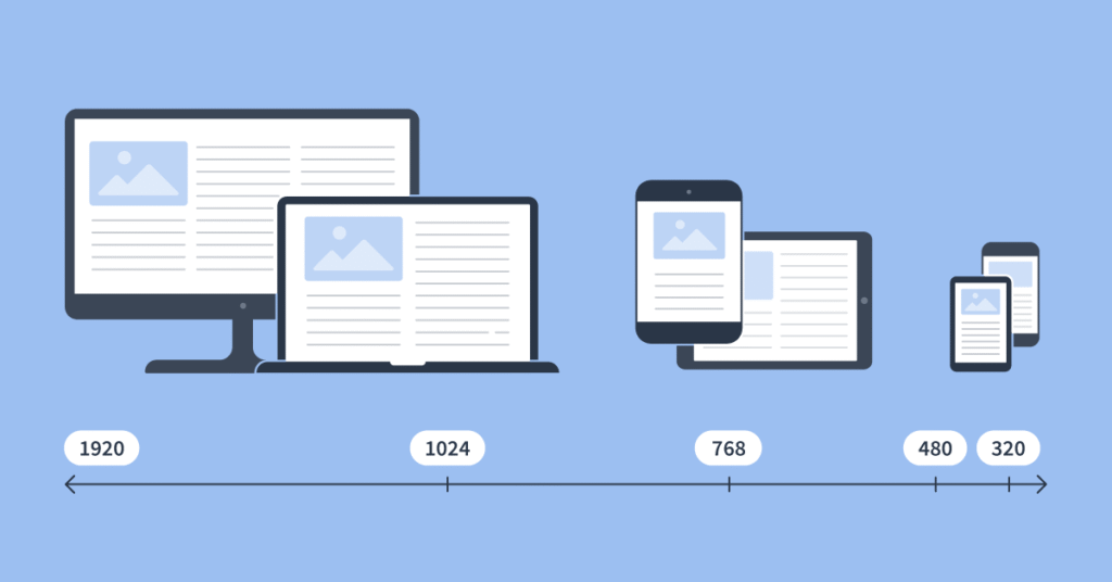
Media queries are a powerful CSS3 technique that allows websites to apply different styles based on device characteristics. Think of them as conditional statements for your website’s appearance. For example, a media query might say: “If the screen width is less than 768 pixels (a common tablet breakpoint), then hide the sidebar, stack the navigation menu vertically, and increase the font size of the main content.”
Analogy: Imagine you have a wardrobe. Instead of buying new clothes for every season or occasion, responsive design is like having clothes that magically adjust to fit the weather, the event, and your body shape, always ensuring you look your best. Media queries are the internal sensors and mechanisms that tell the clothes how to adapt.
4. Why Responsive Design Isn’t Just a “Nice-to-Have”—It’s Non-Negotiable
This is where the rubber meets the road. The benefits of responsive design extend far beyond aesthetics; they directly impact your business’s bottom line, competitive edge, and digital longevity.
Superior User Experience (UX) & Engagement
- Reduced Bounce Rates: When users land on a website that’s difficult to navigate or read on their device, they leave. A responsive site provides a smooth, intuitive experience, encouraging users to stay longer and explore.
- Increased Conversions: A positive UX directly correlates with higher conversion rates. Whether it’s purchasing a product, filling out a contact form, or signing up for a newsletter, a seamless experience removes friction points that often deter users.
- Consistency: Responsive design ensures a uniform brand experience across all devices. This consistency builds trust and reinforces your brand identity, regardless of how a user interacts with your business online.
Undeniable SEO Benefits & Google’s Stance
Google, the undisputed king of search, has been a major proponent of responsive design for years, making it a critical SEO factor:
- Google’s Mobile-First Indexing: Since 2018, Google primarily uses the mobile version of your content for indexing and ranking. If your mobile site is difficult to use or lacks content, it directly impacts your search visibility. You can learn more about Google’s mobile-first indexing here.
- Improved Search Rankings: Mobile-friendliness is a direct ranking factor. Google rewards websites that provide a good mobile experience with higher rankings in mobile search results.
- Single URL, Easier Crawling: With responsive design, you have one URL for your content, regardless of the device. This eliminates duplicate content issues that plagued separate mobile sites, making it easier for Googlebot to crawl and index your site, and better consolidate “link equity.”
- Lower Site Speed Impact: While not inherently faster, a well-implemented responsive design often leads to better performance on mobile due to optimized images and streamlined code, which also contributes to better SEO.
Cost-Effectiveness & Simplified Maintenance
Managing a single responsive website is significantly more efficient than maintaining separate desktop and mobile versions. You save time, resources, and money on:
- Development and design updates
- Content management and publishing
- SEO efforts (only one site to optimize!)
- Ongoing support and bug fixes
This streamlined approach directly impacts your operational budget.
Future-Proofing Your Web Presence
The pace of technological innovation is relentless. New devices and screen sizes emerge constantly. A responsive website is inherently adaptable, meaning it can adjust to these future changes without requiring a complete, costly redesign. It ensures the longevity and continued relevance of your digital storefront.
Enhanced Brand Image & Professionalism
A seamless, professional website across all devices reflects positively on your brand’s image and credibility. Conversely, a clunky, non-responsive site can damage trust, make your business appear outdated, and drive potential customers straight to your competitors.
Accessibility for All Users
Responsive design inherently supports users with various needs and device capabilities, promoting inclusivity. By ensuring your content is readable and navigable on different screen sizes and input methods, you make your website more accessible to a broader audience, which is not just good practice but often a legal requirement.
5. Responsive vs. Adaptive: A Quick Clarification
While often used interchangeably, there’s a subtle but important distinction between responsive and adaptive design.
Responsive Design Explained (Recap)
As discussed, responsive design is fluid and flexible. It adjusts *continuously* to the available screen space, stretching and shrinking elements and rearranging content as needed. It’s like water filling a container, taking its shape.
Adaptive Design Explained
Adaptive design serves different, fixed layouts based on *predefined breakpoints*. For example, a website might have three distinct layouts: one for phones (max-width 480px), one for tablets (max-width 960px), and one for desktops (anything larger). When a device accesses the site, the server delivers the layout best suited for that device’s general category.
Why Responsive Often Wins (Though Adaptive Has Its Niche)
While adaptive design can sometimes offer highly optimized experiences for specific device types, responsive design generally offers more flexibility and is easier to manage for the vast, ever-growing array of device sizes. It’s more future-proof and less reliant on predicting exact device dimensions.
6. Implementing Responsive Design: Best Practices & Considerations
Successfully adopting responsive design requires a thoughtful approach:
The Mobile-First Approach
This best practice involves designing for the smallest screen (mobile) first, then progressively enhancing the design for larger screens. This forces prioritization of content and functionality, leading to leaner code, faster load times, and a superior experience on resource-constrained devices. It’s not just good for mobile users, it improves the overall design process.
Performance Optimization is Key
A responsive site must still be fast. Optimize images (compress, use appropriate formats, implement lazy loading), streamline CSS and JavaScript, and leverage browser caching to ensure rapid load times on all devices. A slow responsive site defeats much of its purpose.
Rigorous Testing Across Devices
It’s crucial to test your website on a range of real devices and screen sizes, not just emulators. Check layouts, functionality, touch targets, and performance. Tools like Google’s Mobile-Friendly Test and browser developer tools are invaluable, but nothing beats real-world testing.
Content Strategy for Adaptability
Content needs to be structured and prioritized with responsiveness in mind. Concise, easily digestible copy is essential for mobile users, while more detailed information can be revealed on larger screens. Think about how headings, paragraphs, and images flow and stack in different contexts.
When to Seek Professional Expertise
While the concept is straightforward, implementing a truly effective, high-performing responsive design can be complex. It requires expertise in front-end development, UX/UI design, and performance optimization. For many businesses, partnering with experienced web developers, like those at Neutrons Agency, is the most efficient and effective path to achieving a top-tier responsive website. We understand the nuances and deliver exceptional web solutions.
7. Common Misconceptions About Responsive Design
Let’s debunk some common myths that prevent businesses from embracing responsive design:
“It’s just for mobile websites.”
Clarification: Responsive design is for *all* screen sizes. It ensures an optimal experience whether someone is on a small phone, a medium tablet, a large desktop, or even an emerging device like a smart fridge or foldable screen.
“It slows down my site.”
Clarification: A *poorly implemented* responsive design might be slow, often due to unoptimized images or excessive code. However, a well-optimized responsive site, built with performance in mind (e.g., mobile-first, image optimization), is incredibly efficient and often loads faster than non-responsive alternatives.
“It’s too expensive to implement.”
Clarification: While the initial investment might seem higher than a quick-fix static site, consider the long-term cost savings. You avoid maintaining multiple sites, spending less on separate SEO efforts, and most importantly, you prevent revenue loss due to poor user experience. It’s an investment that pays dividends.
“My business doesn’t need it; my customers use desktops.”
Clarification: This is a dangerous assumption. Mobile usage statistics consistently show that a significant, if not majority, portion of web traffic comes from mobile devices across virtually all demographics and industries. Even if a conversion happens on desktop, initial discovery and research often begin on mobile. Plus, Google’s mobile-first indexing means even desktop-centric businesses need a strong mobile presence for SEO.
8. Conclusion: Embrace Responsiveness, Secure Your Digital Future
We’ve defined responsive design as the intelligent approach to web development where a single site fluidly adapts to every screen size using fluid grids, flexible media, and media queries. We’ve also explored the compelling reasons why it’s utterly non-negotiable for any forward-thinking business:
- It delivers a superior user experience, leading to higher engagement and conversions.
- It’s crucial for SEO, directly impacting your search rankings and visibility.
- It offers significant cost savings and simplifies maintenance.
- It future-proofs your web presence against evolving technology.
- It enhances your brand image and ensures accessibility for all users.
In today’s multi-device world, a non-responsive website isn’t just inconvenient; it’s a significant competitive disadvantage. It alienates potential customers, frustrates existing ones, and signals to search engines that your site isn’t providing the best experience.
Don’t let your website be a barrier to your success. Now is the time to embrace responsiveness and secure your digital future. We encourage you to check your website’s mobile-friendliness. If it falls short, consider an upgrade. Prioritizing user experience across all devices is no longer an option – it’s a mandate.
Ready to transform your online presence and ensure your website is ready for today’s diverse digital landscape? The experienced team at Neutrons Agency specializes in crafting high-performing, user-centric responsive websites. Contact us today to discuss your project and discover how we can help you build a truly non-negotiable web experience. You can also learn more about our philosophy on our About Neutrons page or explore some of our successful Neutrons Projects.